
Now more than ever, users access products or services on a company’s website through smartphones. Gone are the days when you had to build an amazing website or eCommerce platform for computers.
Your website needs to be responsive and not just move from desktop to mobile phone. Moreover, your business website needs to be compatible with all major devices such as iPhones, iPad, tablets and ensure the website’s usability.
However, an increasing number of companies and brands these days are focusing on the mobile version of the website, instead of the desktop version. In some cases, the desktop site can be viewed on the mobile screen, but it generally results in a bad user experience.
For this reason, when creating a new website for your website through the help of a website design company in San Antonio, a special effort must be put into designing the mobile version. Because using the same design for all devices does not result in a good user experience.
The following are the five most essential features you should include in your mobile web design:
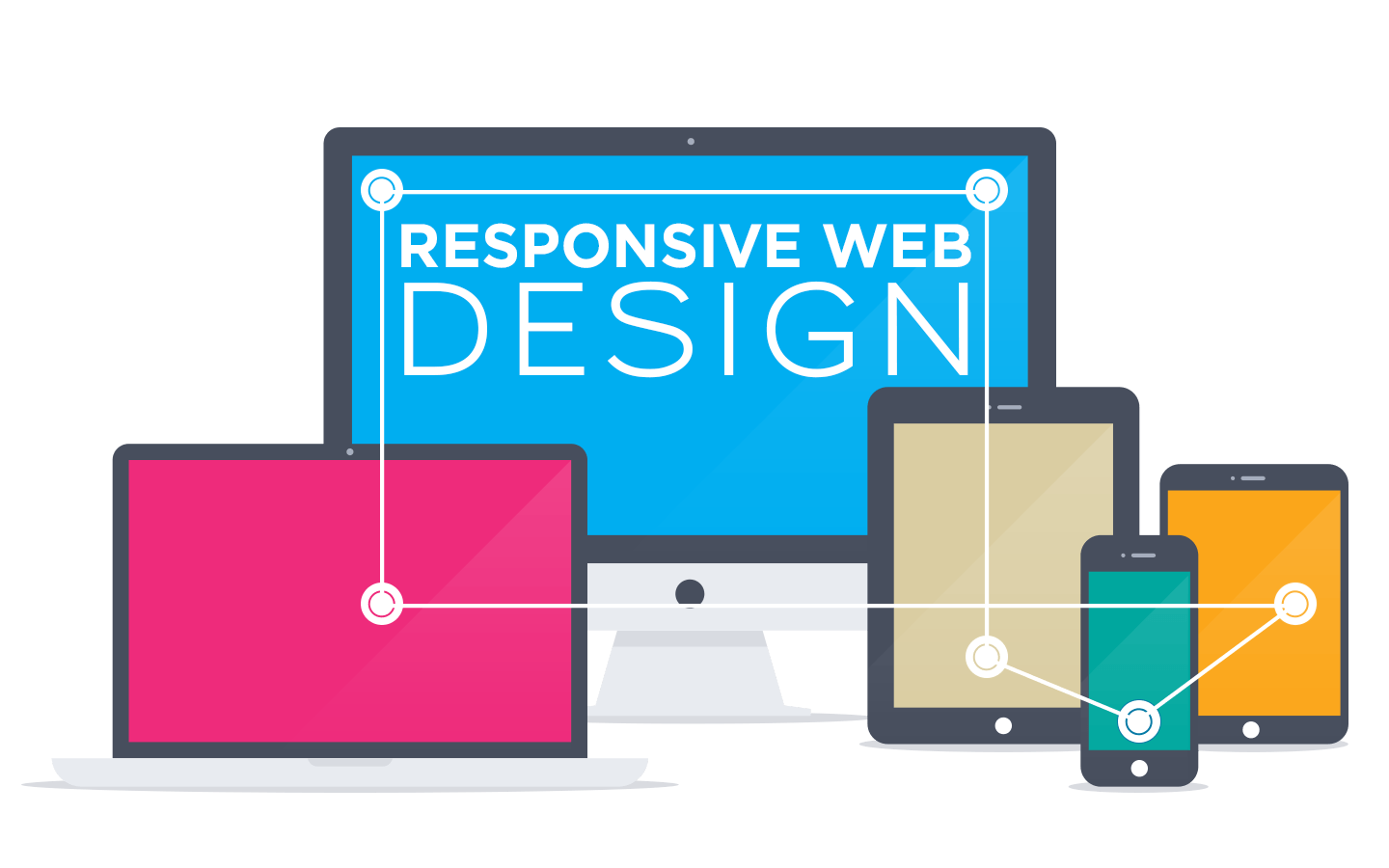
- Responsive Website Design
Your website is not only accessed by a variety of devices with large or small screens, but people regularly return to your site on various devices. This means that your website must deliver the same level of experience to users regardless of the device they are using.
Responsive design is a website system that ensures that the pages of a website are automatically retrieved based on the device used to access them. So it doesn’t matter if you’re using an iPhone, a tablet, or a smartphone; everything will be displayed clearly.
- Design and Information Architecture
Design and information architecture are quite different for a mobile website. Businesses have to tailor the user interface for smaller screen sizes. You want to keep your website structure simple, easy to navigate and make it obvious what actions users can and should take. Even big brands like Virgin Blue are using simple structures on their site as a simple navigation link menu for the home page.
Read 5 Signs You Need a Website Redesign
- Fast Loading Speed
Users find it extremely annoying when they have to wait for a mobile website to load endlessly, and the worst part is when it crashes or hangs. The moral of the story is that if your application takes too long to load, people will abandon it in favor of something else.
Winning mobile applications are responsive and load in less than five milliseconds! To ensure a speedy load time, custom web designers must reduce the number of clicks or touches.
If your app requires a bit more time to load, be sure to include a loading screen that informs users that the site is loading and to be patient with the process.
The faster loading time of the website allows users to enjoy the features of the mobile website, and they do get bored of merely waiting for the content to appear. Website development company experts need to optimize loading speed to reduce data-heavy animation, and provide a navigable simple menu structure that loads in a matter of seconds!
- Functionality
For more complex mobile websites, functionality is a crucial factor. The key to great functionality is to go minimalist. Keep your site pages small and use a clean layout for the entire website. Although apps are a completely different topic, business owners can really learn a lot about functionality from studying the most popular ones in the industry. You will see various complex apps try to go with the minimalist approach.
- Clear Call-to-Action (CTA)
The key to a successful call to action is to make it easy for your website visitors to comprehend what action you want them to do during their stay.
Because many mobile devices, such as phones, have limited access areas, CTA buttons must be designed to accommodate this limitation.
Many websites employ a “live chat” feature that remains on the page even if the page is scrolling. As the user browses, the button is constantly visible and easy to click on.
- Color Palettes
Popular mobile apps and corporate websites use the ”minus-to-less’ strategy to color images. However, that doesn’t mean you have to change the color scheme for your official logo. Instead, when developing a mobile site, ask web designers to use plenty of white space and color schemes below your color scheme.
Be wise while choosing the color. When users open your site on mobile phones, they scroll faster than on the desktop. This means that the richness of the colors you have used will retain and absorb. Therefore, it is recommended to arrange the color palettes so that readers can get the most relevant information.

The Bottom Line
Mobile web design has become an essential component of any professional website. The best way to build a mobile web design is to use responsive design services from the company. The term may seem daunting, but responsive design means your site fits snugly to the screen being viewed. According to Google, 72% of users may return to a website again if it is properly built and optimized for mobile devices. If you want your corporate or brand website to get noticed, you have to consult with web developers in the USA to create the most effective mobile web design for your small, medium, or large-size business.